reset.css
html, body, h1, h2, h3, h4, h5, h6, p, blockquote, code, img, dl, dt, dd, ol, ul, li, fieldset, legend, caption { margin: 0; padding: 0; border: 0; }
div, span, article, section, header, footer, p, ul, li, fieldset, legend, label, a, nav { box-sizing: border-box; }
html {
    height: 100%;
}
body {
    min-height: 100%;
}
html, body, div, span, applet, object, iframe,
h1, h2, h3, h4, h5, h6, p, blockquote, pre,
a, abbr, acronym, address, big, cite, code,
del, dfn, em, img, ins, kbd, q, s, samp,
small, strike, strong, sub, sup, tt, var,
b, u, i, center,
dl, dt, dd, ol, ul, li,
fieldset, form, label, legend,
table, caption, tbody, tfoot, thead, tr, th, td,
article, aside, canvas, details, embed,
figure, figcaption, footer, header, hgroup,
menu, nav, output, ruby, section, summary,
time, mark, audio, video {
	margin: 0;
	padding: 0;
	border: 0;
}
article, aside, details, figcaption, figure,
footer, header, hgroup, menu, nav, section {
	display: block;
}
ol,
ul {
	list-style: none;
}
table {
	border-collapse: collapse;
	border-spacing: 0;
}
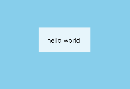
3D 공간을 만들어 주기 위해 먼저 index.html 부터 작성해 주었다
<!DOCTYPE html>
<html lang="en">
  <head>
    <meta charset="UTF-8" />
    <meta name="viewport" content="width=device-width, initial-scale=1.0" />
    <title>Document</title>
    <link rel="stylesheet" href="css/reset.css" />
    <style>
     body {
        background-color: skyblue;
      }
    </style>
  </head>
  <body>
    <div class="container">
      <div class="wall-wrapper">
        <div class="wall wall-left"></div>
        <div class="wall wall-right"></div>
        <div class="wall">
            <div class="wall-content">hello world!</div>
        </div>
      </div>
    </div>
  </body>
</html>
이제 3D 공간감을 위해
container 부분에 perspective 1000px 을 주었다.
     .container {
      	position: fixed;
        perspective: 1000px;
     }

이제
wall-wrapper가 전체를 차지 할 수 있도록 width와 height값을 지정해 주었다.
.wall-wrapper {
        width: 100vw;
        height: 100vh;
}
이제
벽을 생성해준다
3개의 벽을 사용하는데
왼쪽 벽
오른쪽 벽
정면에 보이는 벽이 필요하다
      .wall {
        position: absolute;
        left: 0;
        top: 0;
        width: 100vw;
        height: 100vh;
        background: rgba(255, 255, 255, 0.8);
      }
      .wall-left {
        width: 1000vw;
        transform: rotateY(90deg) translateZ(-500vw);
      }
      .wall-right {
        width: 1000vw;
        transform: rotateY(90deg) translateZ(-400vw);
      }
      .wall-content{
          font-size: 12rem;
          height: 100vh;
          display: flex;
          align-items: center;
          justify-content: center;
      }
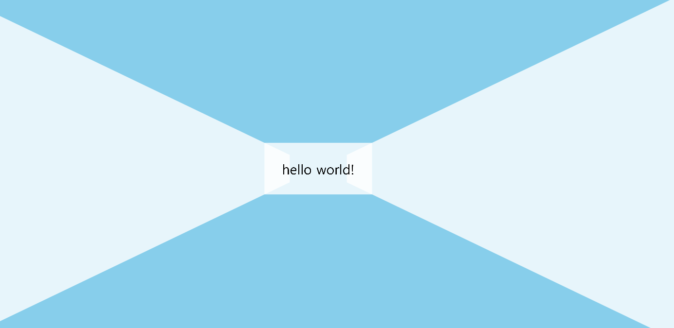
벽을 3개로 absolute로 겹친 후에
transform rotateY를 통해 Y축 회전으로 벽을 회전 시킨 뒤 translateZ를 통해 z축을 변형시켜준다
(wall -left를 기준으로 기본 회전 축은 중앙에 위치하여있고 중앙의 길이는 500vw이다. 따라서 translateZ로 500vw를 빼준다, 또한 )

그럼 위와같은 화면이 나온다
이제 기존에 위치한 벽에 Z축으로 뒤로 밀어준다.
  .wall-wrapper {
        width: 100vw;
        height: 100vh;
        transform: translateZ(-500vw);
      }
위와 같이 축을 뒤로 밀게 되면
옆면의 left-wall과 right-wall이 적용 되어 있지 않다.
이는 perspective 속성이 container에 있어 해당 perspective 속성은 연속으로 자식에게 전달 되는게 아니라
부모 -> 하위(1단계) 에 한에서만 전달이 된다.
이에 perspective 속성을 전해주기 위해서는 transfrom-style: preserve-3d를 활용하면 된다
하위 속성에도 perspective 속성을 전해 줄 수 있다.
  .wall-wrapper {
        width: 100vw;
        height: 100vh;
        transform: translateZ(-500vw);
        transform-style: preserve-3d;
   }
마지막으로 animation을 추가해주면 마무리 된다.
<!DOCTYPE html>
<html lang="en">
  <head>
    <meta charset="UTF-8" />
    <meta name="viewport" content="width=device-width, initial-scale=1.0" />
    <title>Document</title>
    <link rel="stylesheet" href="css/reset.css" />
    <style>
    @keyframes wallComming{
        from{

        }
        to{
            transform: translateZ(-20vw);
        }
    }
      body {
        background-color: skyblue;
      }
      .container {
        position: fixed;
        perspective: 1000px;
      }

       .wall-wrapper {
        width: 100vw;
        height: 100vh;
         animation: infinite wallComming 5s alternate ;
        transform: translateZ(-500vw);

      }

      .wall {
        position: absolute;
        left: 0;
        top: 0;
        width: 100vw;
        height: 100vh;
        background: rgba(255, 255, 255, 0.8);
      }
      .wall-left {
        width: 1000vw;
        transform: rotateY(90deg) translateZ(-500vw);
      }
      .wall-right {
        width: 1000vw;
        transform: rotateY(90deg) translateZ(-400vw);
      }
      .wall-content{
          font-size: 12rem;
          height: 100vh;
          display: flex;
          align-items: center;
          justify-content: center;
      }
    </style>
  </head>
  <body>
    <div class="container">
      <div class="wall-wrapper">
        <div class="wall wall-left"></div>
        <div class="wall wall-right"></div>
        <div class="wall">
            <div class="wall-content">hello world!</div>
        </div>
      </div>
    </div>
  </body>
</html>

www.inflearn.com/course/interactive_web/dashboard
위의 강의를 듣고 정리 및 응용한 글입니다.
'CSS' 카테고리의 다른 글
| CSS - Grid (0) | 2020.12.20 |
|---|---|
| CSS - flex (0) | 2020.11.29 |
| CSS - 3D (0) | 2020.11.28 |
| CSS - animation (0) | 2020.11.28 |
| CSS- transform , transition (0) | 2020.11.27 |


